A few months ago, one of my close friends moved to another city for his studies. After settling in, we caught up over a call like always.
He told me how hectic his days had become, college, projects, deadlines and how he barely had time or the skills to cook.To solve this, he tried a few local tiffin services, hoping for decent, home-style food.
But the experience turned out frustrating — poor hygiene, repetitive menus, no flexibility, and zero customer support.That conversation stuck with me. It made me realise that this isn’t just his story, it’s the reality for many people living away from home.
Tackle the daily struggle of finding reliable, home-style meals by creating an platform that simplifies access to freshly cooked home like, affordable food — offering flexible plans that bring convenience, comfort, and consistency to everyday dining.
First I had to understand how people manage their daily meals while living away from home.
I spoke with some students, early-career professionals, and solo residents in metro cities through 1:1 interviews to validate assumptions and uncover their real challenges.
Using the 5Ws & 1H framework (Who, What, When, Where, Why, and How), I explored their meal habits — how they decide what to eat and what makes food feel “worth it.”
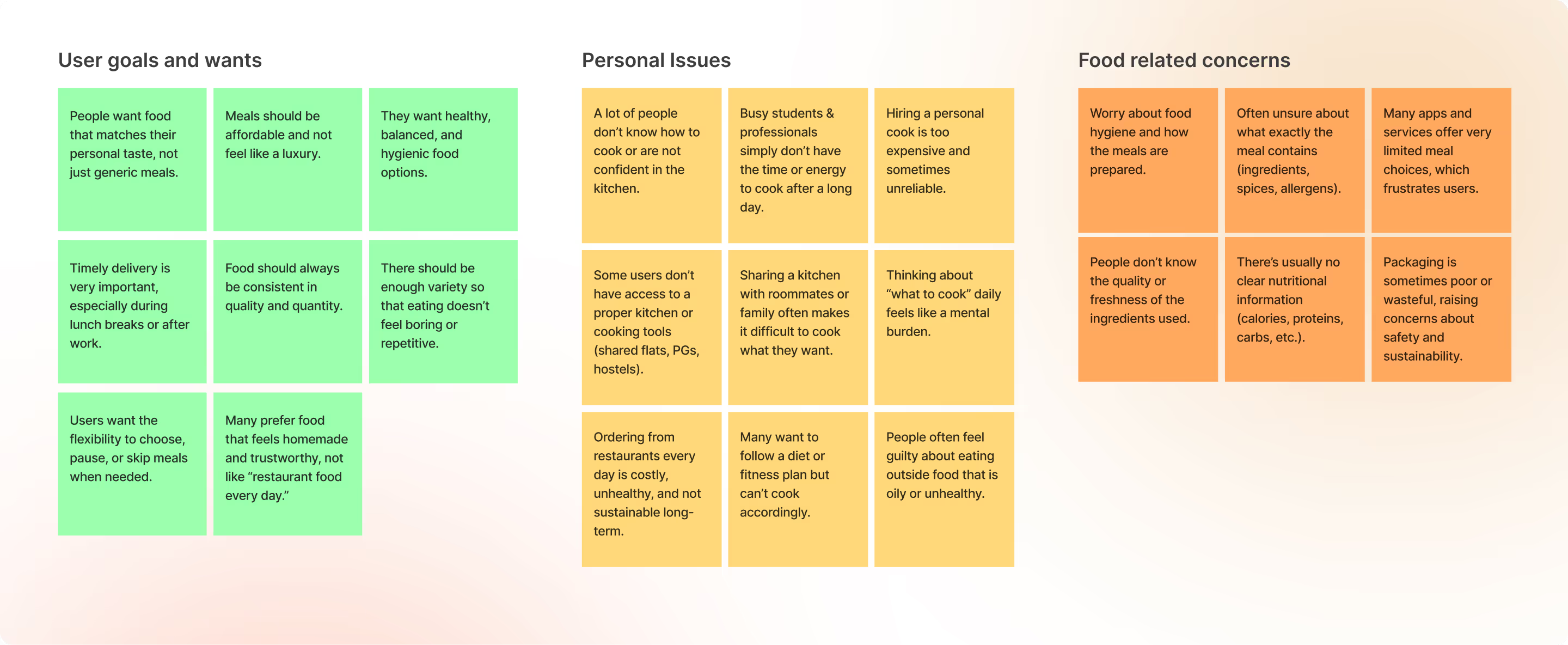
Initial interviews helped me frame the problem, but I needed to measure the scale of the issue. So I did a survey using Google survey, and these were my key observations:
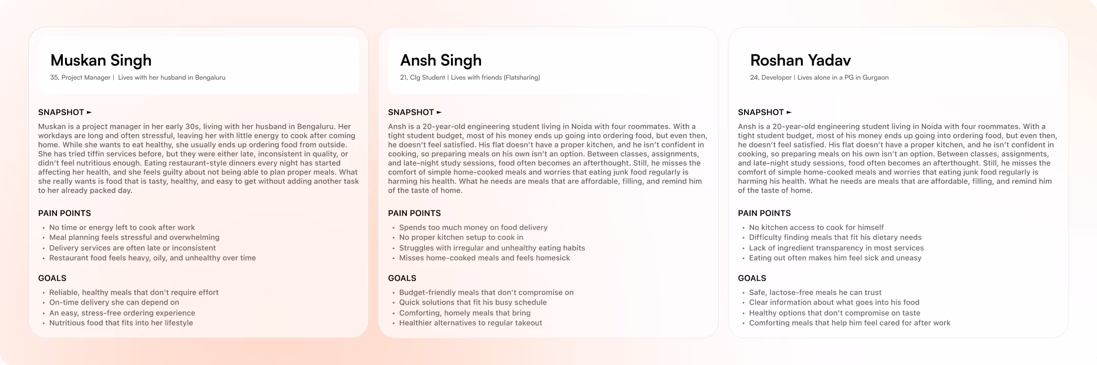
Core Users — Core users are mostly young adults and students living in PGs or shared flats, who are health-conscious but busy.
Why need solution — Because they don’t have time or skills to cook, hiring a cook is costly for some, and local tiffin services are often unreliable and unhygienic.
What They Care Most — They care most about fresh, hygienic, tasty food, reliable on-time delivery, and affordable, flexible meal options.
Trust Drivers — Most people want to know about the kitchen and the cook before subscribing. This trust factor is important and it increases their willingness to try a new meal service.
After the research phase, I looked into existing competitors to study their features, user experience, and gaps that I could improve upon.
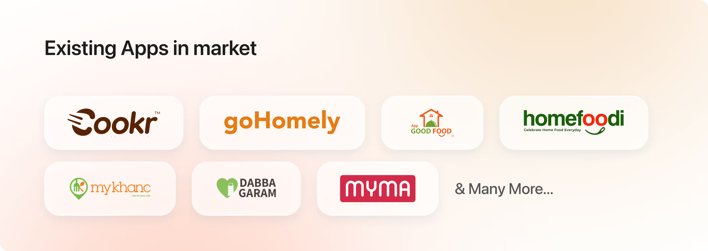
The goal was to identify user frustrations and gaps in existing apps, uncover opportunities to enhance the experience, and define clear differentiators that would make my solution stand out.
To achieve this, I analysed user flows, features, design approaches, and Play Store reviews of similar platforms, and came up with the key user frustrations and pain points given below.
Hard to Find and Trust Providers — Users can’t easily find reliable, hygienic meal providers.
Doubts on Food Quality and Portions— Concerns about freshness, hygiene, taste, and portions.
Limited Meal Details and Personalization— Menus miss details like ingredients, nutrition, and variety.
Payment Hassles— Hidden fees, limited options, and unclear refunds.
Complicated User Experience Cluttered, confusing interfaces make ordering frustrating. fees, limited options, and unclear refunds.
Unreliable Delivery and No Tracking— Delays, wrong orders, and no real-time tracking.
Poor Support & Feedback— Hard to reach help or share feedback.
Rigid Ordering System— No flexible subscriptions or meal schedules. to reach help or share feedback.
The research and competitive analysis helped me clearly understand users’ pain points & pain points, So I created three personas to represent the key user groups and their needs.
Key Objectives
After synthesizing all user insights, I narrowed the focus down to three core objectives that would shape the product direction:
Convenience — Users wanted a simple, quick way to discover and order homely meals without navigating complex flows or unnecessary steps.
Affordability — Many preferred homemade food but struggled with inconsistent pricing and limited budget-friendly options, especially students and young professionals.
3. Choice & Quality — Users needed reliable options with variety, freshness, and transparency — clear menus, dietary details, and trustworthy kitchens before subscribing.
The idea is to make ordering feel as simple as eating at home — with trust, comfort, and convenience at the centre of the experience.
With the key objectives in place, I structured the Information Architecture to define how users will navigate the app and access core features.

✨ Visual adventure starts here…
To establish the visual direction, I created a mood-board capturing the tone, style, and overall feel I wanted the product to reflect.

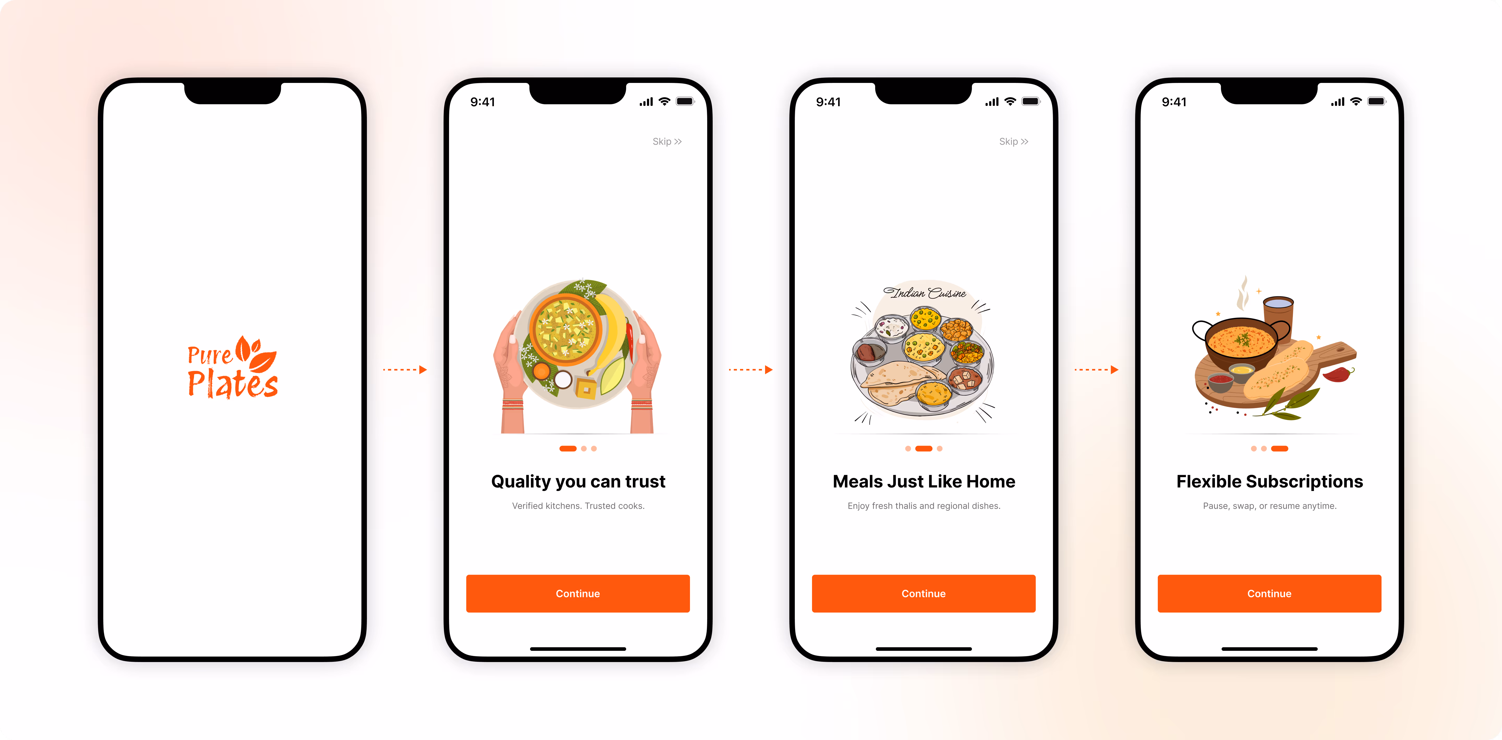
Introducing Pure Plates
Food like home, for busy lives
User Onboarding
The app opens with a quick splash and onboarding screens that clearly show what Pure Plates offers — trusted quality, homestyle meals, and flexible subscription plans.
It gives users a fast, clear idea of the service before they start.After synthesizing all user insights, I narrowed the focus down to three core objectives that would shape the product direction:
Authorization
While designing this flow, I studied patterns from leading food-delivery apps and followed familiar UX conventions. This helps users feel comfortable and reduces any learning effort.
Users can log in quickly using their phone number or Google/Email, followed by a simple OTP verification.
Once verified, the app asks for location access so we can show accurate delivery options. Users can either enter their address manually or use their current location and confirm it directly on the map.

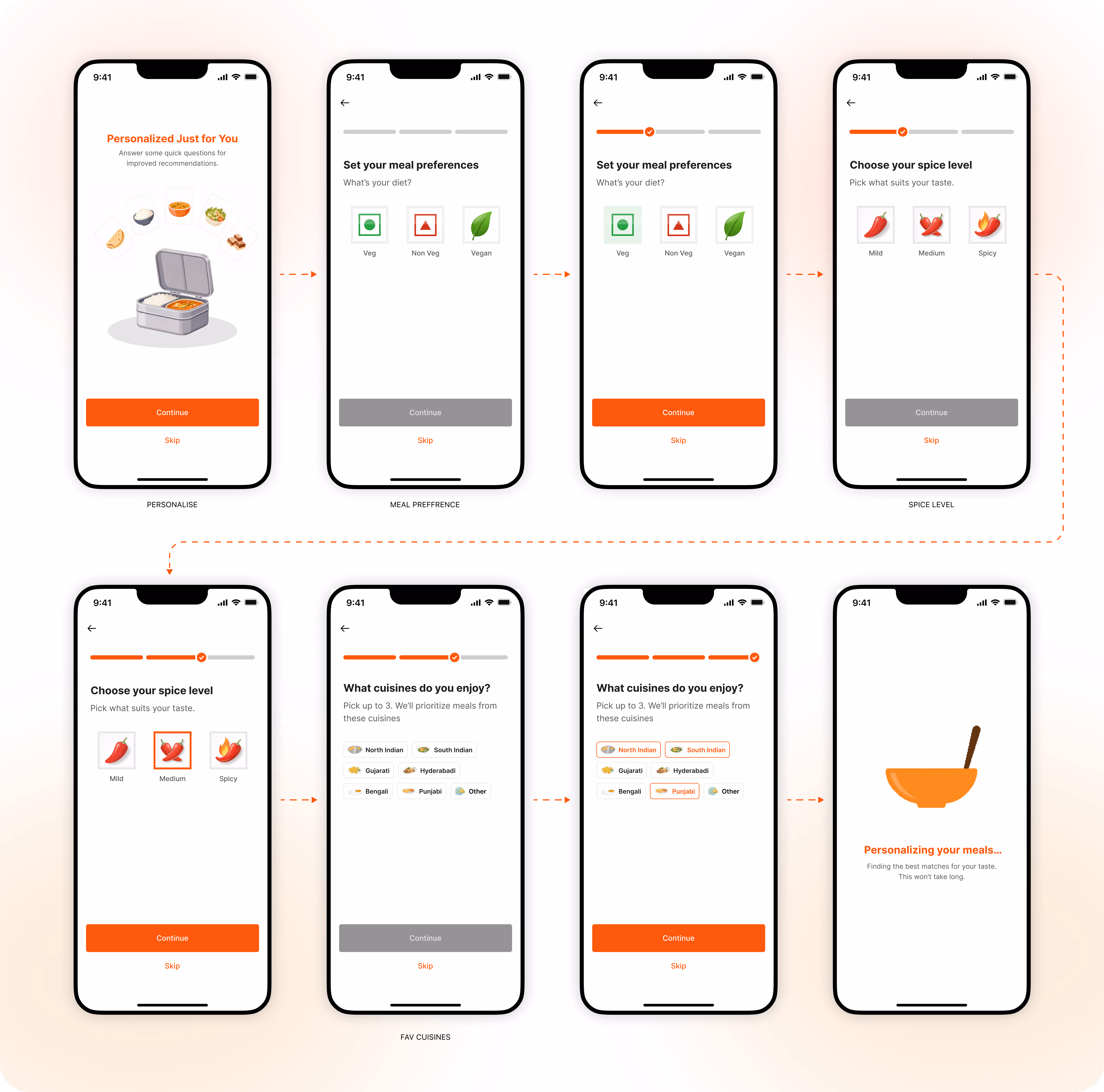
Personlization (optional)
I added a quick, optional personalization flow to understand users’ tastes and suggest the best meals/Kitchens based on their preferences.
Users can set their meal preferences (Veg/Non-Veg/Vegan), choose their spice level, and select their favorite cuisines.
Every screen follows simple choices, clear visuals, and a “Skip” option, keeping the experience smooth and user-friendly while still gathering useful personalization data.
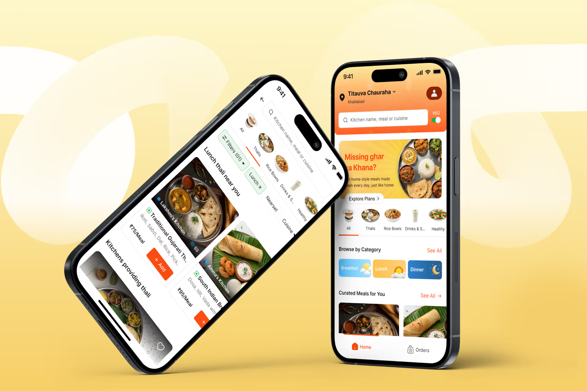
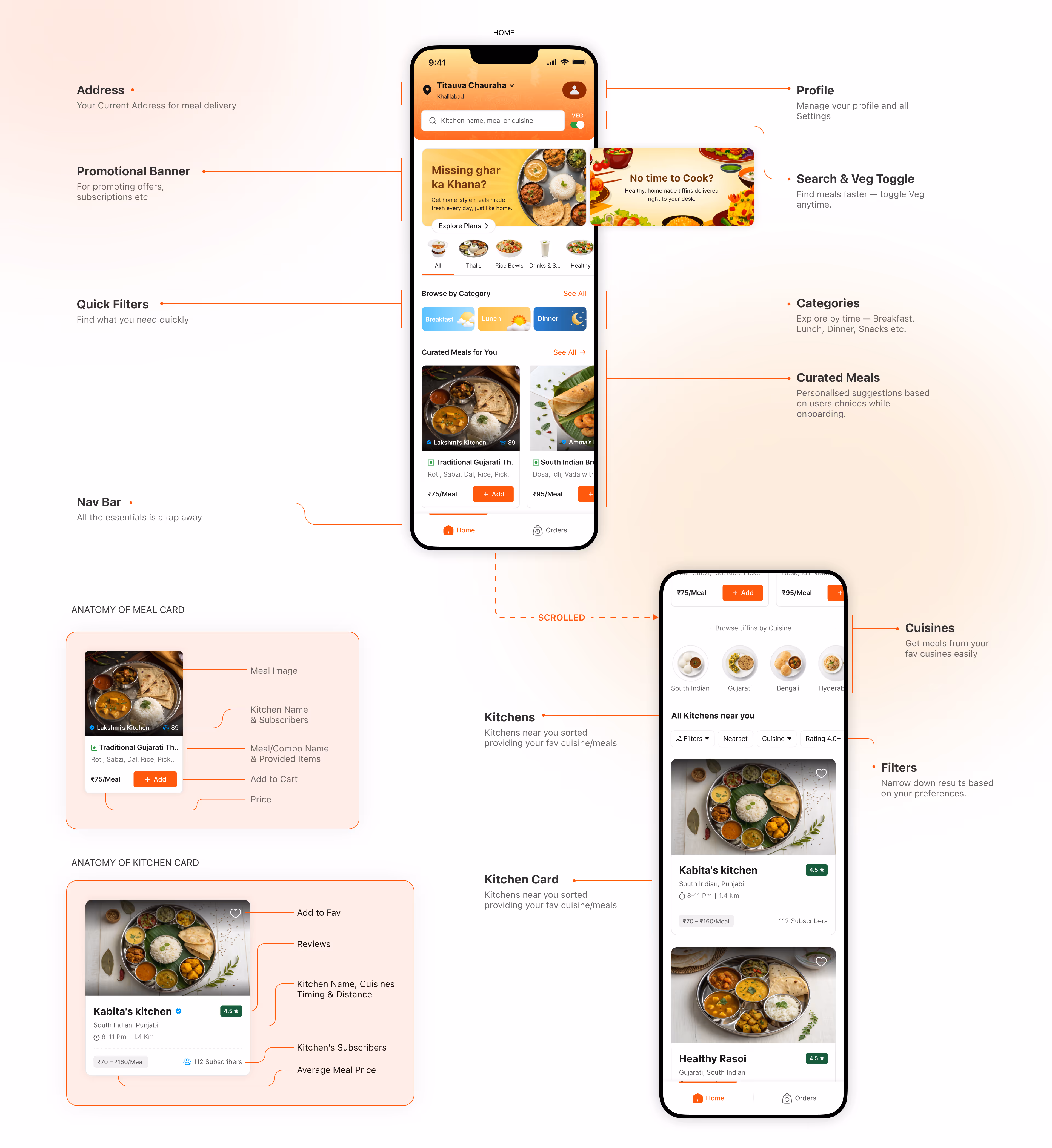
Home
The Home Screen is where the user interacts the most, so I designed it to be clear, familiar, and usable in all scenarios — from one-time orders to subscription-based meals.
The layout follows proven patterns from popular food apps, helping users feel at home instantly. The screen is divided into well-structured sections, ordered by what users need first: delivery address, offers, quick filters, categories, curated meals, and nearby kitchens.
Each section is designed with clean hierarchy, making it easy to explore meals, switch veg/non-veg, browse cuisines, or add items quickly — all within a single, seamless flow.
From here on, I’ll be showcasing the flows one by one and explaining how each task is performed inside the app.
1. One time Order
For users who just want to try/use the service or don’t need a full subscription. It allows them to quickly pick a meal and place an order without committing long-term.

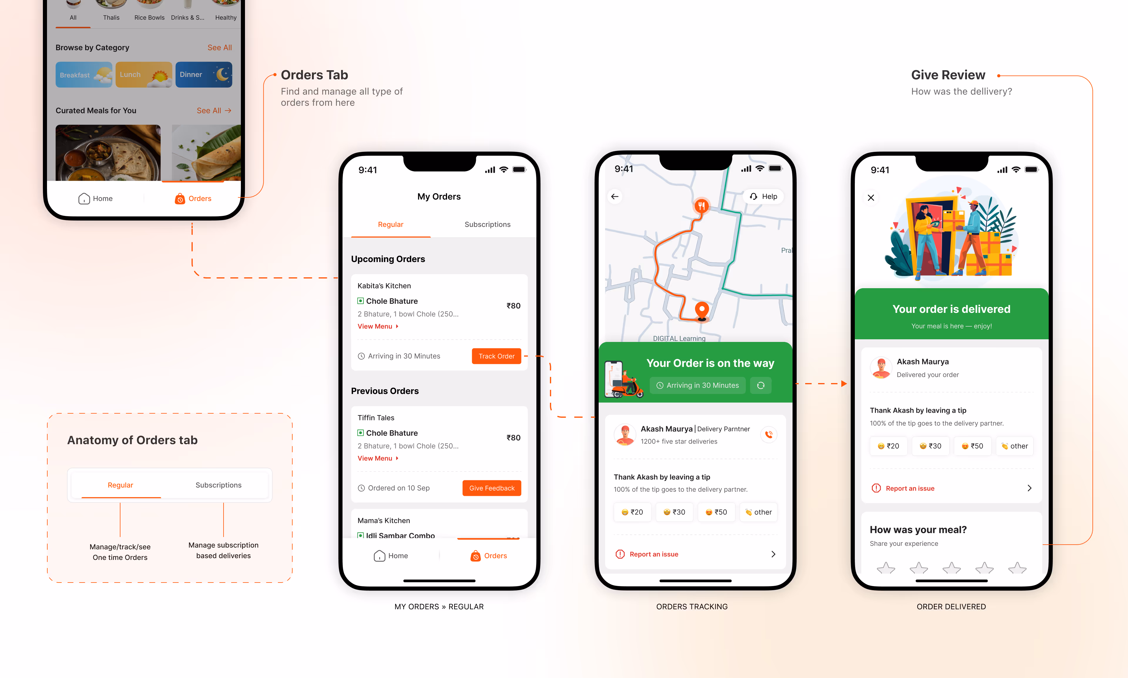
2. Order Tracking
Lets users see their order status and delivery progress.
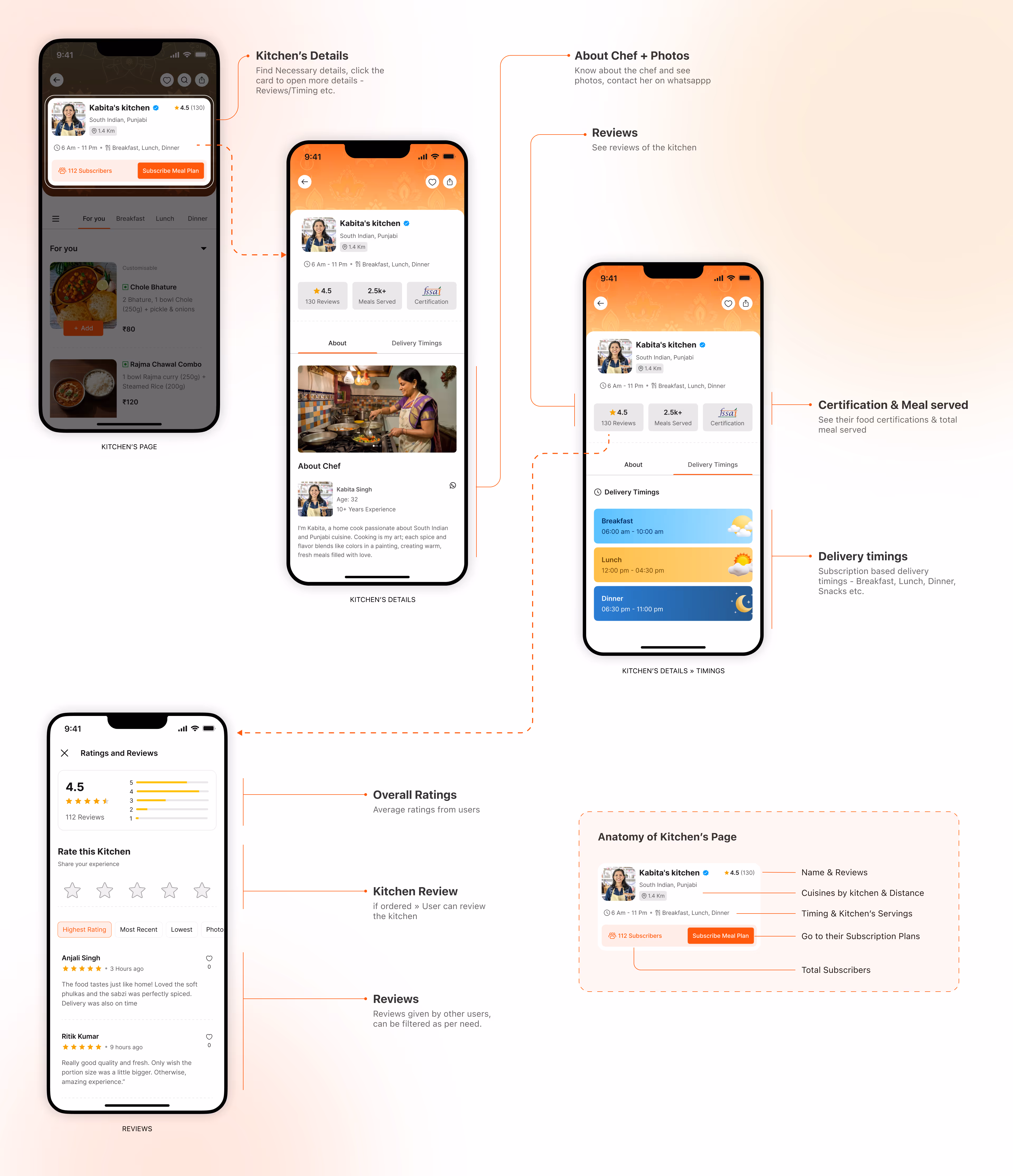
3. Kitchen’s Page
Each kitchen has its own dedicated page where users can explore all the details they need. During research, I found this to be a key decision point for users before subscribing.
So I kept this page transparent and informative, showing everything a user expects — subscription plans, delivery timings, kitchen photos, and reviews from other customers. This helps users quickly judge if the kitchen is the right fit for them.
4. Subscribe A Plan
Once the user decides on a kitchen, Tapping Subscribe Meal Plan takes the user to all plans offered by the kitchen.
Plans are grouped by meal slots — Breakfast, Lunch, Dinner, or any additional categories the kitchen provides. Users can quickly compare timings, pricing, repetition cycles, and even expand a plan to view the full weekly menu. This transparency helps the user understand exactly what they’ll receive each day.
Now after deciding user clicks on subscribe -
Add Ons — If available, user can customise it with available add-ons — extra items, portion upgrades, chutneys, or sides. This step ensures the order feels personal and flexible.
Address & Meals — The user selects the delivery address and configures their meal schedule. They can pick delivery timings (within kitchen’s delivery time) and choose the specific days they want meals delivered — perfect for skipping weekends or adjusting around their routine.
Choose A Plan — The user can select the best suited plan and choose a start date. They can also enable WhatsApp notifications and reminders before the subscription expires, reducing missed renewals.
Review — The final screen summarises all choices — plan, schedule, add-ons, price breakdown, and start date — so the user can confirm everything before paying.

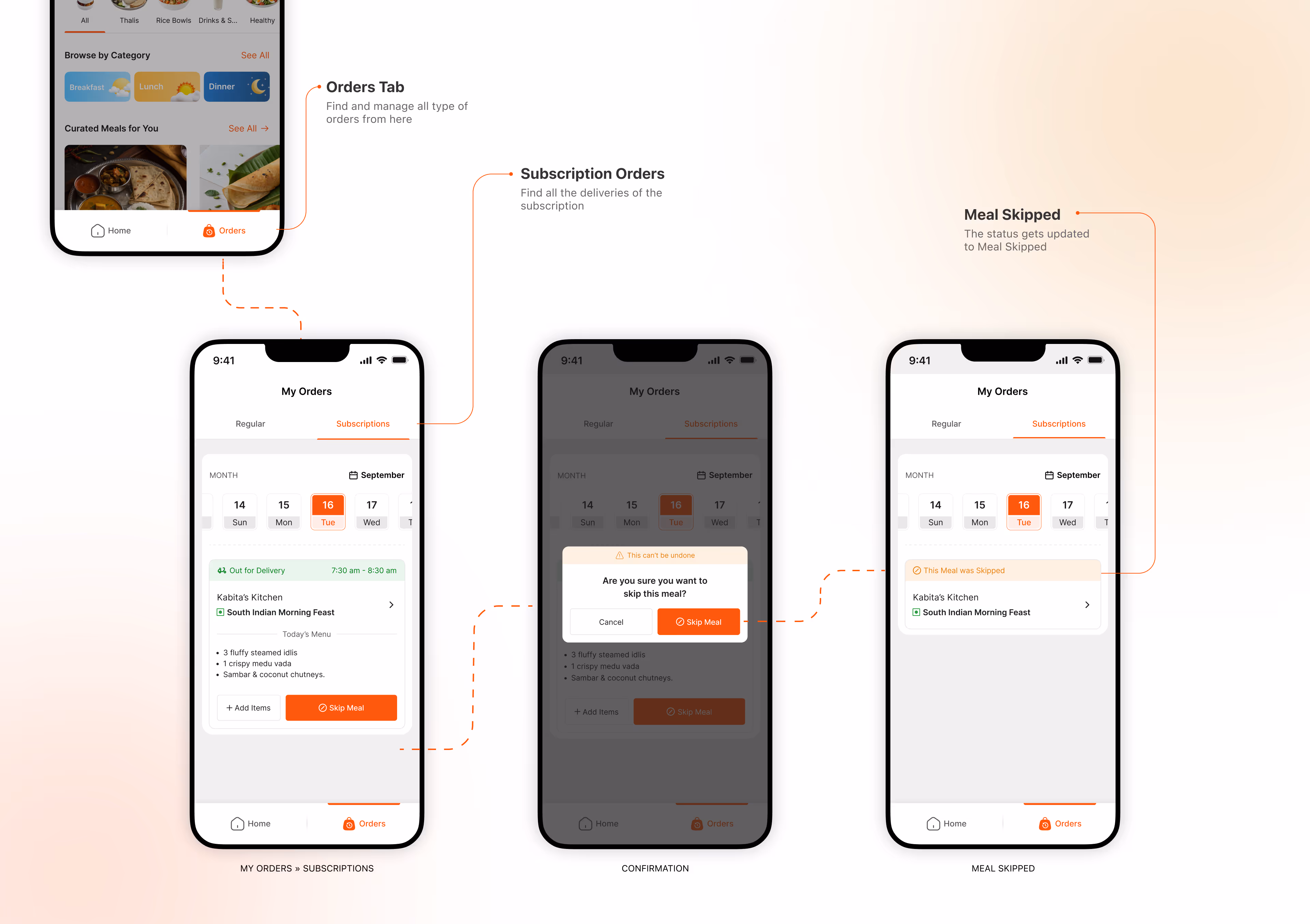
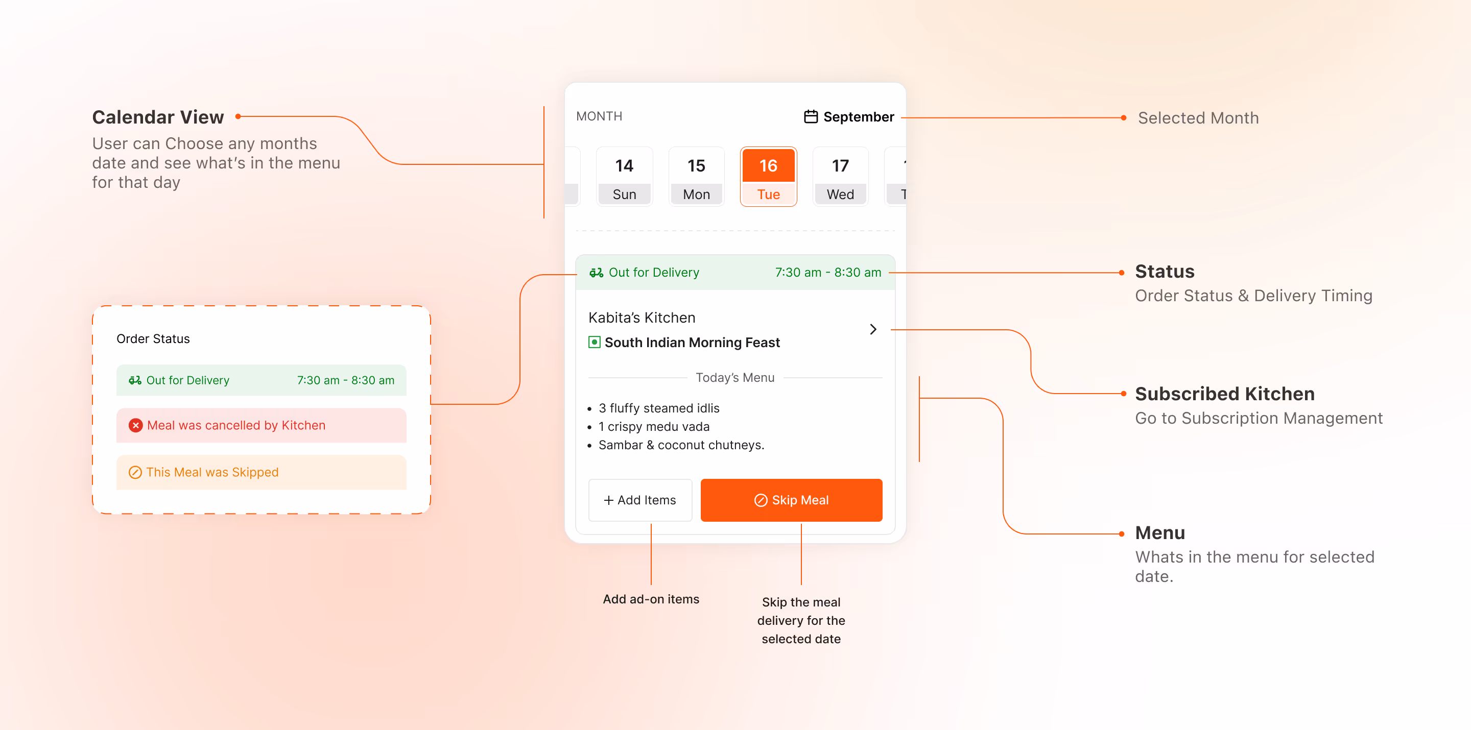
5. Managing Daily Meals
After subscribing A Meal plan the user can see & Manage their everyday meal delivery from here.
Skip Meal — Users can skip a meal in advance (minimum 8 hours) to avoid food and effort going to waste. Each plan includes a limited number of skips they can use as needed.
Add-Ons — Users can add extra items to their delivery. If an add-on is included in their plan, it’s free; otherwise, they can pay for additional items at checkout.
Meal Card Breakdown
A quick breakdown of the meal card to show how users check the menu, delivery status, kitchen info, add-ons, and skip options.
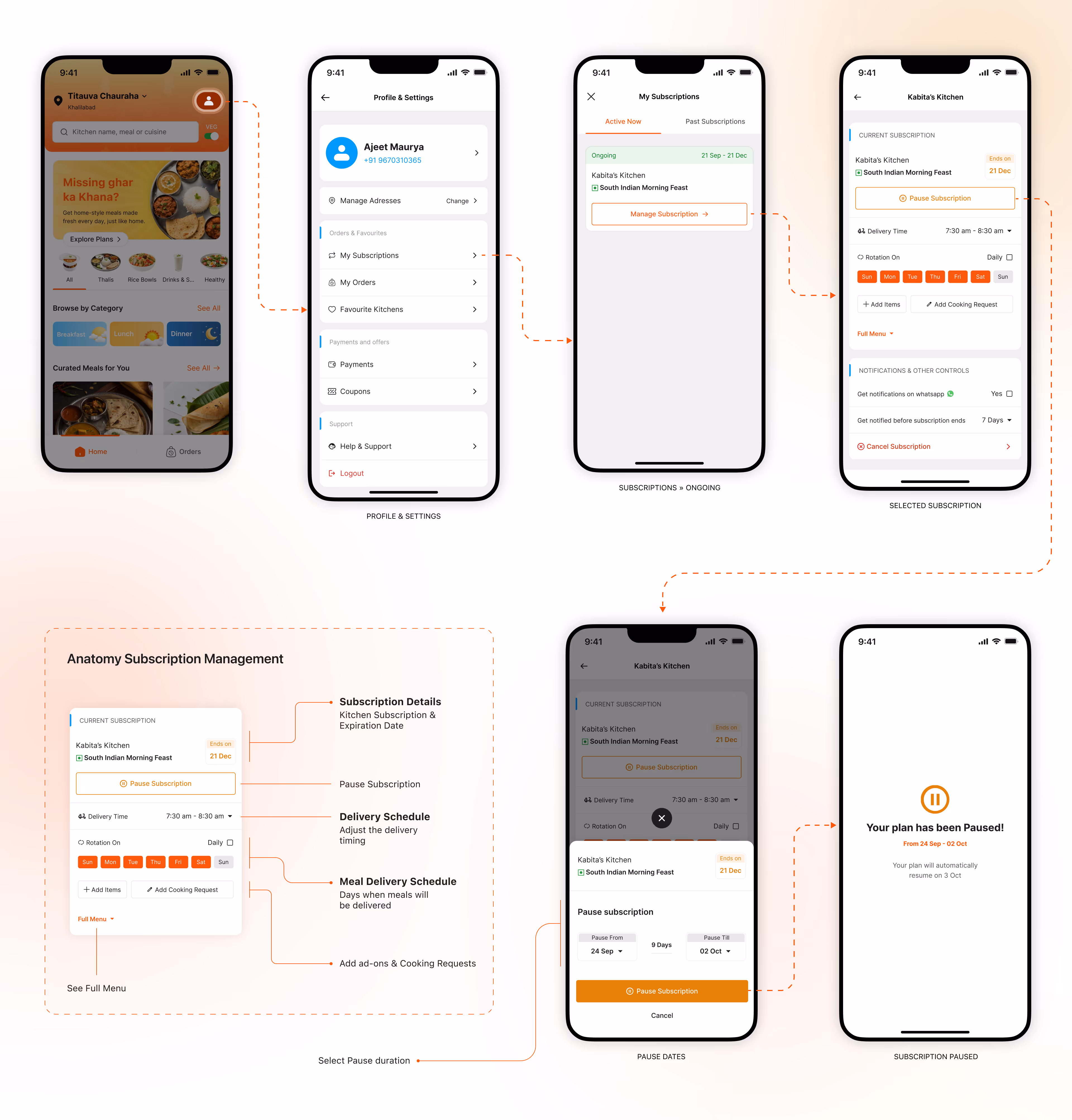
6. Pause Subscription
Users can pause their meal plan for a limited number of days through a simple date-selection UI.
If they exceed the allowed limit, an extra charge applies — this prevents kitchens from too many pauses while still giving users flexibility. The app also sends notifications to keep them informed.
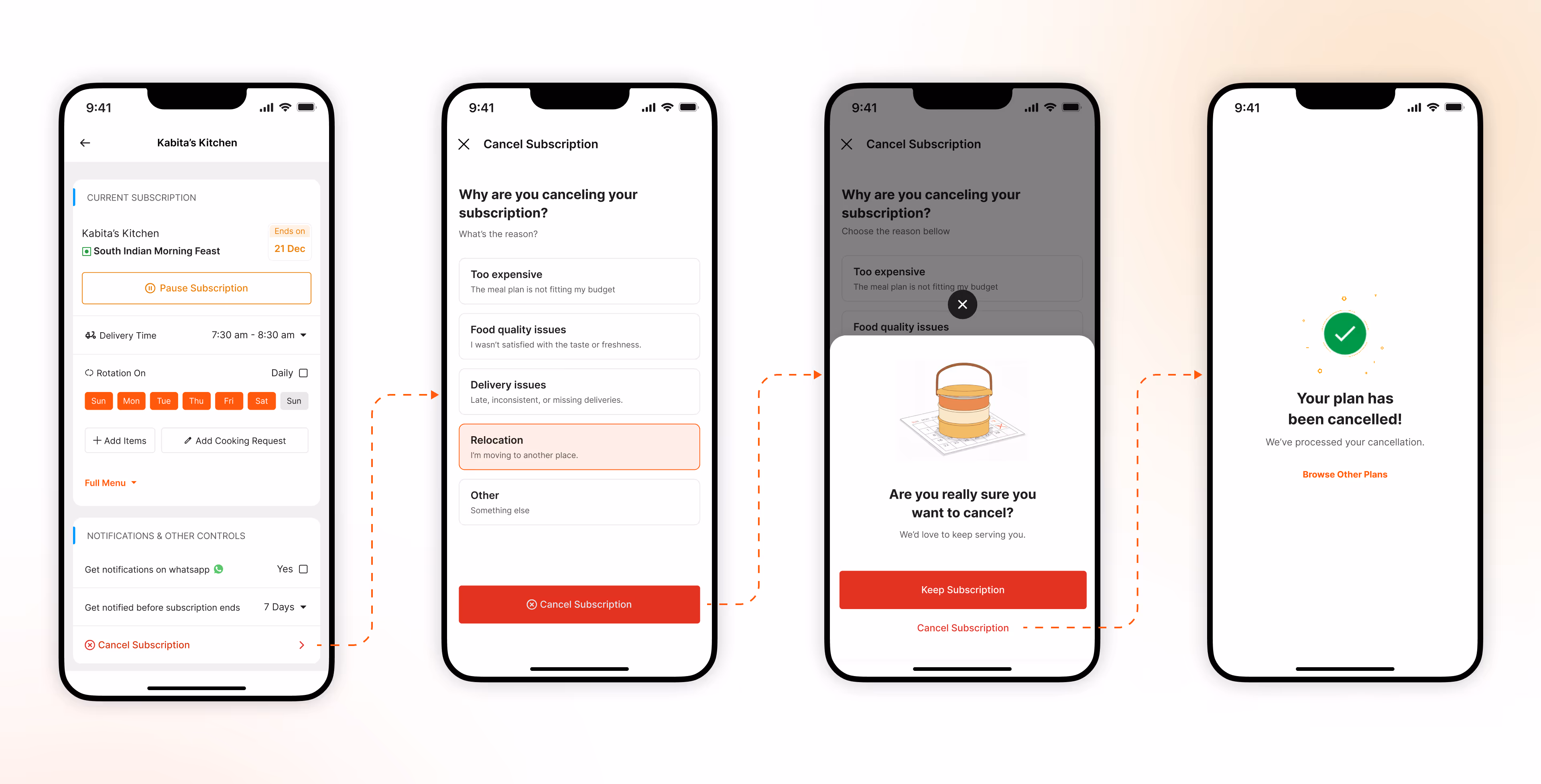
7. Cancel Subscription
And now finally Users can cancel their plan through a clear, guided flow that captures the reason and confirms the action.
Since the app lets users try meals before subscribing, cancellations due to taste or mismatch are less likely — making this flow mainly for genuine cases like relocation or schedule changes.
And… We’re Done!
If you’ve scrolled this far, congratulations — you officially have more patience than my Figma auto-layout. 😭
I’m currently looking for new design opportunities, so if you think I’d be a good fit (or you just want to make my day), feel free to refer me or connect.